
It is evident that our poster, website and teaser trailer are instantly recognizable alongside each other, which is excessively important for branding purposes. The make-up and costuming of our protagonist is a clear ‘pull’ and we wanted it to feature heavily in each text.
Typography
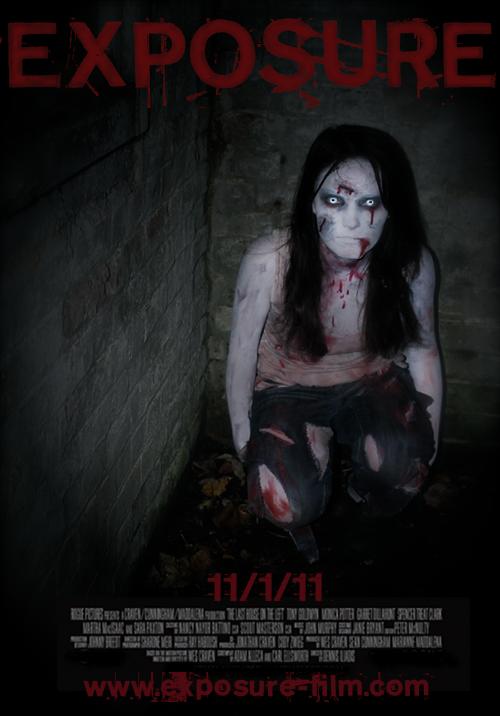
Throughout our promotional package we used the same font and colour scheme. The font colour is red to match and bring out the blood, especially in the poster, which is the same in the website and trailer. The red, white and black colour scheme has clear connotations of death, as well as isolation and vulnerability. After researching into the different styles of font used in slasher films, which in the past has been more gory and bloody, but more recently is subverting to the modernisation of culture and is typically more simple, we selected a font that had both of these elements on dafont.

Although our typography is the same in all three texts, we used slightly different colours to match the mise en scene of the particular product. For example, the colour of the title is redder in our teaser trailer because we had to ensure it stood out and contrasted with the fast editing of the shots beforehand. On the other hand, in our poster, the focus was more on the character, and so we tried to blend the title into the background more, therefore giving it a darker colour but it is still clearly visible. The website again is not focussed on the title and more on Emily's face.
Character
Our main product, the teaser trailer, is very focused on our main protagonist and consequently we did not have to hide her in our other two ancillary texts. Although the actual photograph is different, the website and poster both show Emily as a pale, bloody character, with her eyes directed straight at the audience. This ‘look’ is continued in our main product as it includes close-ups of her face and eyes, as well as long shots still directed at the audience. This is effective in making the audience feel uncomfortable with the close proximity of the character, at the same time not letting them in, as her eyes are abnormally white.
In terms of the other character shown in only the teaser trailer, she is not at all featured in the other two products, meaning the audience will not recall her as a main character, which is what we wanted. We chose Emily to be the predominant character because she clearly reflects the genre with her makeup and costuming, and she is memorable.
Imagery
In our promotional package we used the same location to portray a sense of isolation. We felt using the same location was important because it coincides with the anticipated narrative of the film. The mise en scene is very dark, making Emily stand out more and to create a sense of dark imagery. We tried to use the same lighting for the teaser trailer and the photographs taken for the poster and website.
Typography
Throughout our promotional package we used the same font and colour scheme. The font colour is red to match and bring out the blood, especially in the poster, which is the same in the website and trailer. The red, white and black colour scheme has clear connotations of death, as well as isolation and vulnerability. After researching into the different styles of font used in slasher films, which in the past has been more gory and bloody, but more recently is subverting to the modernisation of culture and is typically more simple, we selected a font that had both of these elements on dafont.

Although our typography is the same in all three texts, we used slightly different colours to match the mise en scene of the particular product. For example, the colour of the title is redder in our teaser trailer because we had to ensure it stood out and contrasted with the fast editing of the shots beforehand. On the other hand, in our poster, the focus was more on the character, and so we tried to blend the title into the background more, therefore giving it a darker colour but it is still clearly visible. The website again is not focussed on the title and more on Emily's face.
Character
Our main product, the teaser trailer, is very focused on our main protagonist and consequently we did not have to hide her in our other two ancillary texts. Although the actual photograph is different, the website and poster both show Emily as a pale, bloody character, with her eyes directed straight at the audience. This ‘look’ is continued in our main product as it includes close-ups of her face and eyes, as well as long shots still directed at the audience. This is effective in making the audience feel uncomfortable with the close proximity of the character, at the same time not letting them in, as her eyes are abnormally white.
 |
| Poster |
 |
| Website |
 |
| Screen shot of trailer |
Imagery
In our promotional package we used the same location to portray a sense of isolation. We felt using the same location was important because it coincides with the anticipated narrative of the film. The mise en scene is very dark, making Emily stand out more and to create a sense of dark imagery. We tried to use the same lighting for the teaser trailer and the photographs taken for the poster and website.
No comments:
Post a Comment