Friday 26 November 2010

Poster Designing

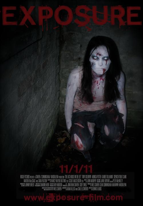
This is an unfinished design of our poster. The title fits nicely at the top with the release date at the bottom. Once we have our website sorted we will put the url under the release date as well. Depending now on how further editing goes, we might need a tagline to go under the title, something extra for the audience to remember.


However, I asked a focus group for feedback and this is what they said:

  • The font colour is perhaps slightly too bright and takes away from the image.
  • There is a lot of space round Emily so cropping would be a good idea.
  • Again to do with cropping, Emily is quite small and too central - her eyes should be more in the 'golden section' (which is what we'd designed anyway).
  • The edges could be faded out slightly more so the audience's eyes are directed straight to Emily.

(The same image is used in these two posters.)

I tried fitting all the necessary information onto the poster, but in the first design especially there is a massive space on the left (which we were going to try are merge a photo but it might look a bit messy), so in the poster on the right I put the tagline there.

Choosing the right colours is really important and in both posters I used a variety of colours to see which work best. I think that the colours in the poster on the right look the best because they're slightly darker. The title should be the brightest though. The tagline also obviously needs to be written and placed correctly.

We also need to sort out the actual photo. I just realised that Emily's hands aren't white like the rest of her skin, which is a problem. The image is also too bright which makes it look quite amateur, but on the plus side it could link in quite well with the photographic side of our narrative. On our final day of filming (Monday 29th) we will try and get a similar shot to use for the final poster.


This image on the left is the image we're using for our website. It seems to make a really nice poster image as well, if we decide we want Emily to be completely shown like this.
The only problem is that there are so many different shades of red, we'll have to try and find one for the title that works. We can try to do this by selecting a colour from Emily's 'blood'.
Another thing to work on in this image is the edges which might need more fading out, especially at the top where the title is.


This image is the same as the previous poster but the colours are slightly edited. Emily's face is a lot paler and more illuminated. The edges are also faded out more. Again I experimented with the colour of the font to try and match it to the image.

NA

Thursday 25 November 2010

Title

We have finally decided on the title for our teaser trailer: EXPOSURE


We feel this fits with our film without a doubt as ideally we wanted only a single word to capture the genre and narrative. We first looked at words such as 'abandon' and less specific words such as 'horror' to find a synonym that would describe the film. However, once we decided on the narrative we felt something more obscure to do with photography would fit best - as our protagonist is a photographer entering into the house and most of our footage involves the camera flash.

We first came up with 'Capture' which we thought absolutely captured (harhar) the narrative because not only was it to do with photography, but it describes also the protagonist getting trapped inside the house. Although, after some primary research from focus groups it seemed that this title was not original and far too obvious. We then struggled with photographic words that would fit and came up with things like 'Point of View' and 'Aperture' which obviously didn't work at all.

Finally, the word 'Exposure' came to light and it seemingly fits with both the horror and photographic sides of the narrative.

Monday 22 November 2010

Website Development


We have started to produce our website using the free web builder "Yola" however, the site is restricting our creative abilty and we are unable to create our design. Therefore, we have decided to test out other web builders so we can create the website we were hoping to create.

After further research into website builders, we have found that Wix.com lets us use far more advanced tools and features, which will allow us to produce a professional looking site for Exposure. An example of what we can create using this web builder is shown below:

Friday 19 November 2010

Editing

We have now managed to edit the footage we have so it will be much easier to slot in the rest of the trailer once we've filmed some more. Below is the edited footage we do have:


We found ourselves to be quite lucky as our filming went so well and we got so much footage, there wasn't too much to edit. We did spend a lot of time, however, finding the 'impact shots' and the best shots to put in, which involved a lot of splitting and cropping. Our teaser trailer will be very fast-paced and so we sped-up a lot of shots, for example so that we only have a flash of Emily's face. The only thing we have yet to do with these shots is maybe colour alterations, which we don't feel we can do until the end so everything is more or less the same throughout.

The music also is clearly incomplete, but again we can't do that until everything is put together. The drone at the beginning is just something we found on iMovie but is the type of sound we want at the start of the trailer with the establishing shots and the shots of our protagonist walking into the house. The sound at the end is not final but we definitely want something like this to end the trailer.

The typography, though decided, has yet to be added in also.

Wednesday 17 November 2010

Typography for Title

Websites such as 'DaFont' offer free horror style fonts that would be suitable for our teaser trailer.  Below are a few examples of fonts that we are considering:


Experimenting with possible fonts using the teaser trailer title and the background tally wall ...

Thursday 11 November 2010

Character Research and Inspiration (Victim)

The Wall

A possible part of our teaser trailer will be the protagonist finding a wall plastered in newspaper cuttings, and photographs of Lucy Allen. Her face will be scribbled out and crossed out so that it is obvious that there is something wrong, as soon as this is seen, the protagonist will hear a bang/knocking at the other end of the abandoned house.


Taking inspiration from films such as 'Enduring Love' I have created some newspaper cuttings, missing posters, photographs and sketches, some of which have been burnt and splattered with blood.


Monday 8 November 2010

Filming - 05/11/10


We had our first proper night of filming on the 5th and from looking at our footage this morning, we think it went pretty well as we have all the shots of Emily by herself that we need. We used a section of a house that was suitable to film these scenes, e.g dark, empty and run down. We took the opportunity to take photographs, as Emily was in full costume, to generate more poster ideas. An example is shown below:


This photograph, once flipped, helped us generate more website design ideas as well. Below is one design for our website with an edited version of this photograph.


The video below is a collection of some of the shots from our footage - completely unedited.

NA

Thursday 4 November 2010

Media Institutions

Film4
The company develops and co-finances film productions and is known for working with the most innovative talent in the UK, whether new or established. Film4 is a founding partner of the Warp X digital studio. http://www.youtube.com/watch?v=tzcydfOWFnw&feature=related


Dark Castle Entertainment
Dark Castle Entertainment was formed in 1999 and is a division of Silver Pictures, a production house affiliated with Warner Bros. Dark Castle Entertainment's name pays homage to William Castle, a horror filmmaker from the 1950s and 1960s. When first formed, the goal was to remake Castle's horror films. After two remakes, it moved on to producing original material, along with remakes of non-Castle films.
http://www.youtube.com/watch?v=tGljx71ZWtg


Ghost House
Ghost House is a production company focussing on the next generation of horror audiences, and is partnered with Grindstone Entertainment Group, the largest distributor of direct-to-video films, to extend the brand to a series of titles made for the home entertainment market. It's films include the Grudge series and Drag Me To Hell.
http://www.youtube.com/watch?v=LclB5xFavjI&feature=related


Twisted Pictures
Twisted Pictures is a production company, mainly creating films of the horror genre. It gained wide attention through the production of the Saw series.


After some further research, we have decided to feature Twisted Pictures in our teaser trailer, as it fits best with our genre, and the films it has produced are films we would want our film to be associated with.

NA

Film Classifications

The British Board of Film Classification is a national independent non-governmental body, which has classified cinema films since it was set up in 1912, and videos since the passing of the Video Recordings Act in 1984.
These are the guidelines off the BFFC website that we need to refer to while deciding on what certificate to give our film.

For a 12A/12 Certificate


12A/12 – Suitable for 12 years and the ‘12A’ category exists only for cinema films. No one younger than 12 may see a ‘12A’ film in a cinema unless accompanied by an adult, and films classified‘12A’ are not recommended for a child below 12. The ‘12’ category exists only for video works. No one younger than12 may rent or buy a ‘12’ rated video work.

Drugs - Any misuse of drugs must be infrequent and should not be glamorised or give instructional detail.
Horror - Moderate physical and psychological threat may be permitted, provided disturbing sequences are not frequent or sustained.

For a 15 Certificate


Suitable only for 15 years and over. No one younger than 15 may see a ‘15’ film in a cinema. No one younger than 15 may rent or buy a ‘15’ rated video work.

Drugs - Drug taking may be shown but the film as a whole must notpromote or encourage drug misuse. The misuse of easilyaccessible and highly dangerous substances (for example,aerosols or solvents) is unlikely to be acceptable.
Horror - Strong threat and menace are permitted unless sadistic or sexualised.


For an 18 Certificate


Suitable only for adults. No-one younger than 18 may see an ‘18’ film in a cinema. No-one younger than 18 may rent or buy an ‘18’ rated video.

Where material or treatment appears to the BBFC to risk harm to individuals or, through their behaviour, to society – for example, any detailed portrayal of violent or dangerous acts, or of illegal drug use, which may cause harm to public health or morals. This may include portrayals of sexual or sexualised violence which might, for example, eroticise or endorse sexual assault.

NA

Film Website - Good Example

Is there room from improvement? 
This website on the whole is very effective, user friendly and gets straight to the point. However, the website does not allow you to scroll down, therefore there are no credits or external links at the bottom of the page. This is something that we will include on our website as it links to other media and will advertise our Facebook pages, Twitter and Flickr.

Tuesday 2 November 2010

Make-Up and Costuming for 'Lucy Allen' (Evil Girl Character)

After experimenting with various materials, I have collected the essentials needed to represent the 'dead girl' in the teaser trailer. This includes face paints, eye shadows, moulding wax, fake blood, the tools needed to apply these and finally the white contact lenses.


The inspiration for this make-up comes from looking at other 'evil girl' characters, in films such as 'The Ring', 'Shutter' and 'The Abandoned', shown in the blog post below.

Again inspired by some of the most successful horror films of the past decade,  this is the completed costume. These were made by being stained in red (and other tones of) face paints representing blood, ripped up, burnt and stretched to create a trashed and old quality.