Showing posts with label posters. Show all posts

Thursday, 9 December 2010

Final Poster

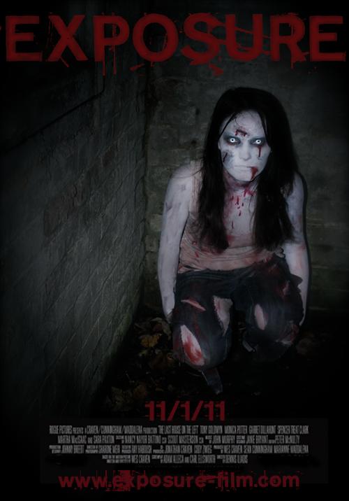
Here is the final design for our poster:


There are a few slight changes we need to make, for example there is a box behind the white text from the way we stuck it onto the image, so this needs to be blended in, and we're still not completely certain on the colour of the title.

This design has clearly changed from our previous ideas. We felt that as we had the text all the same colour in the same font, it looked too amateur and simple. Though simpliciy is what we're going for with our poster, we need it to look professional. The added white text has not only broken up the red font, but it adds a further dimension to the poster and, though our previous research and deconstructions, is what the majority of films use in their own promotional packages. We also enhanced the colouring on Emily and made her more pale and almost glowing, as if to appear more supernatural. We also chose a different shot where her hands aren't showing (the make-up wasn't right, as stated in a recent post).

NA

Friday, 26 November 2010

Poster Designing

This is an unfinished design of our poster. The title fits nicely at the top with the release date at the bottom. Once we have our website sorted we will put the url under the release date as well. Depending now on how further editing goes, we might need a tagline to go under the title, something extra for the audience to remember.


However, I asked a focus group for feedback and this is what they said:

  • The font colour is perhaps slightly too bright and takes away from the image.
  • There is a lot of space round Emily so cropping would be a good idea.
  • Again to do with cropping, Emily is quite small and too central - her eyes should be more in the 'golden section' (which is what we'd designed anyway).
  • The edges could be faded out slightly more so the audience's eyes are directed straight to Emily.

(The same image is used in these two posters.)

I tried fitting all the necessary information onto the poster, but in the first design especially there is a massive space on the left (which we were going to try are merge a photo but it might look a bit messy), so in the poster on the right I put the tagline there.

Choosing the right colours is really important and in both posters I used a variety of colours to see which work best. I think that the colours in the poster on the right look the best because they're slightly darker. The title should be the brightest though. The tagline also obviously needs to be written and placed correctly.

We also need to sort out the actual photo. I just realised that Emily's hands aren't white like the rest of her skin, which is a problem. The image is also too bright which makes it look quite amateur, but on the plus side it could link in quite well with the photographic side of our narrative. On our final day of filming (Monday 29th) we will try and get a similar shot to use for the final poster.


This image on the left is the image we're using for our website. It seems to make a really nice poster image as well, if we decide we want Emily to be completely shown like this.
The only problem is that there are so many different shades of red, we'll have to try and find one for the title that works. We can try to do this by selecting a colour from Emily's 'blood'.
Another thing to work on in this image is the edges which might need more fading out, especially at the top where the title is.


This image is the same as the previous poster but the colours are slightly edited. Emily's face is a lot paler and more illuminated. The edges are also faded out more. Again I experimented with the colour of the font to try and match it to the image.

NA

Monday, 8 November 2010

Filming - 05/11/10


We had our first proper night of filming on the 5th and from looking at our footage this morning, we think it went pretty well as we have all the shots of Emily by herself that we need. We used a section of a house that was suitable to film these scenes, e.g dark, empty and run down. We took the opportunity to take photographs, as Emily was in full costume, to generate more poster ideas. An example is shown below:


This photograph, once flipped, helped us generate more website design ideas as well. Below is one design for our website with an edited version of this photograph.


The video below is a collection of some of the shots from our footage - completely unedited.

NA

Monday, 25 October 2010

Initial Poster Designs

Okay so clearly these are VERY rough designs of posters but hopefully the whole idea is clear. Each design will be very dark and focus on the girl with the title at the top and credits/release date at the bottom.
The first poster shows the girl sitting in the corner of the abandoned room, idealy in the 'golden section' of the poster. On one of the walls the tally chart featured in the trailer will be clearly visible - the contrast of the photo heightened to bring out the blood-red writing.
The second design shows the girl hanging in the room, again with the tally in the background (possibly the 2 photos merged together). Her face is slightly tilted upwards to face the camera.
The last design is a close-up shot of the girl's face (like the photos we've previously taken).

Wednesday, 20 October 2010

Typography Analysis

An analysis of typography used in a current film poster:

Tuesday, 12 October 2010

Further Make-Up Trials/Poster Ideas

After further make-up trials and edited photographs, this is the sort of result we are getting, could be a possible poster idea? Although we acknowledge that this has been done alot already in the past, so for the first try it is a good result, however we will continue to develop ideas and create an original film poster for our teaser trailer...

Thursday, 16 September 2010

Analysing existing posters...


We decided to look at some existing posters in the horror genre, which will eventually inspire us for our own.

Wednesday, 15 September 2010

Film Poster - The Strangers

The tag line at the top is in white so it stands out to the audience. It also creates more fear for the audience as it shows that there is something to fear in the film.
The dark lighting in the house play on the fear of loneliness. The fact that the main character has her back to the dark figure in the background shows fear of the unknown.
The audience are immediately drawn to the main character as they are positioned at the front of the poster, however they are to the left, they will then notice the dark figure in the centred of the poster but at the back which will shock the audience.

The setting of the poster also show invasion of personal space as it is in what looks like a ‘normal home’ with the objects on the table.

The actors in the film are written in yellow and in a small font and therefore do not stand out very much. This shows that there aren’t any big actors in the film.

The title is positioned at the bottom of the poster which means it is not the centre aim of the poster but the picture is. The font suggests a ghostly storyline as the letters are smudged with the light.

The tag line bellow the title also creates fear for the audience as it is based on true events.

NC