Monday 25 October 2010

Initial Poster Designs

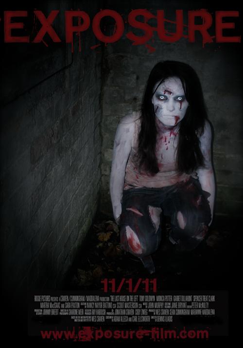
Okay so clearly these are VERY rough designs of posters but hopefully the whole idea is clear. Each design will be very dark and focus on the girl with the title at the top and credits/release date at the bottom.
The first poster shows the girl sitting in the corner of the abandoned room, idealy in the 'golden section' of the poster. On one of the walls the tally chart featured in the trailer will be clearly visible - the contrast of the photo heightened to bring out the blood-red writing.
The second design shows the girl hanging in the room, again with the tally in the background (possibly the 2 photos merged together). Her face is slightly tilted upwards to face the camera.
The last design is a close-up shot of the girl's face (like the photos we've previously taken).

Thursday 21 October 2010

Website Criteria

What we hate about websites:
- Confusing - too much to read/look at
- Too much clicking to get where you want
- Not aesthetically professional
- No search bar to get exactly where you want
- Unrelated pop-ups and adverts

What we love about websites:
- Clear, legible layout - professional
- Relevant to the topic/product
- Unique style of presentation

Specific Criteria to create a successful website:

Functionality
– Cultural awareness
– Text download order
– Interaction times
– LEGALLY copyrighted
– Intellectual property

Design
- Graphic design
- Typography
- User-design
- Aesthetics
- Professionalism (quality of finish)
- Use of colour
- Layout
- Attention to detail

Content
- Purpose
- Interactivity
- Verbal Expression
- Core issues

Originality
- Creativity
- Distinctiveness
- Multi-sensory/emotional expression
- Predictive research

Overall Effectiveness
- Operational effectiveness
- Communication effectiveness

Wednesday 20 October 2010

Typography Analysis

An analysis of typography used in a current film poster:

Shooting Script

We have devised a shooting script in order to know exactly which shots will be filmed when. This is a compression of what we plan to do:


Tuesday 12 October 2010

Further Make-Up Trials/Poster Ideas

After further make-up trials and edited photographs, this is the sort of result we are getting, could be a possible poster idea? Although we acknowledge that this has been done alot already in the past, so for the first try it is a good result, however we will continue to develop ideas and create an original film poster for our teaser trailer...

Friday 8 October 2010

Further Make-Up Trials

We have experimented further with what we can create with the make-up kit and this is what we came out with...
We have been continually adding to our narrative, and thought it possible if the girl in our teaser were to have been hanged or have had her throat slashed, and this gash on her throat are the marks left. Since this is only a trial, I think next time it would have been better if the blood had been darker since the girl will have been dead for some time and her skin would need to be alot white and paler.


Camerawork/Editing Ideas...

We have looked a lot at the film 'The Abandoned' and from the teaser trailer we found a very good example of fast editing and camera work so you see parts of the location and get a feel for the film but don't give too much of the plot away: 


Ideally fast-cut shots like this will appear in our trailer in order to give flashes of scenes in order to create a sense that time is moving on. 

Thursday 7 October 2010

Make-Up Tests

We have a make-up kit to use for fake blood and cuts. This is the first experiment we did with a bloody cut on my finger. The process was fairly simple but we clearly need more practise in making it look realistic - the blending especially. Although, cuts and bruises aren't the main focus of any particular shots so there won't be any close-ups of them.