
To produce our teaser trailer and ancillary tasks we had to consider a variety of codes and conventions for the slasher horror genre, to ensure that all our products would be successful and appeal to our target audience.
TEASER TRAILER
Costuming and Make-Up
The attire worn in psychological horror films would involve the ‘evil girl’ to wear plain white or grey dresses. Therefore to avoid confusion and concentrate on the slasher look, films such as ‘The Abandoned’, 'The Exorcist' and ‘Saw’ together inspired us to create our costumes and realistic make-up. The key similarities we found were; to have normal clothes, such as a t-shirt and jeans, and to completely tear the pieces apart covering them in blood and dirt. The make-up, to make the ‘evil girl’ appear like a corpse took a principle usually used in psychological films. However we have developed this, using the pure white coloured skin commonly seen in films such as 'The Ring' we mixed this with facial blood cuts and white eyes (lenses) seen in slasher horror films. We challenged the slasher genre however, by choosing not to use a mask for the villain, which is a convention often seen. We wanted the audience to be aware of the evil girl, but still only showed her in quick flashes so that they could not gain the full picture.
INSPIRATION: FINAL PRODUCT:


Location
From watching and deconstructing numerous films, we found that an important convention was to highlight isolation through location. Abandoned buildings and houses emphasise this idea of isolation and the unknown. After location scouting in our local area, we found a site which had a number of small abandoned buildings, including a warehouse, however it was not practical to film here due to the land waste. Through more research, we found a small derelict room at the back of a friends house, which is where we captured most of our footage of the 'evil girl'. In addition, we also found an large abandoned house, which us allowed to shoot wider shots as well as shoot scenes with the second actress as the protagonist. The environment was a perfect setting; dark, run down and isolated, it had all the key features that the location would have in 'The Abandoned', and so followed the codes and conventions of a typical horror film.
FIRST LOCATION: Small derelict room

SECOND LOCATION: Abandoned house

In horror teaser trailers, it is typical to find very fast editing with only flashes of 'graphic' images, this is usually accompanied with loud eerie music, quiet disconcerting sounds or even silence to create maximum suspense. The beginning of our trailer shows slightly longer shots, which do not reveal much, and this is matched with parallel sound which is still loud and eerie but at a much slower tempo compared to the sound used in the disequilibrium for the rest of the trailer. Once the flashes begin, the music picks up the pace and the audience begin to see the fast cut editing technique. We challenged older real media texts by choosing not to use silence or quiet sound in our trailer. This was to follow the conventions of modern horror, which use more upbeat or rock music, and so we chose to a piece of music called 'Time to Die' uploaded on YouTube which appears below:
Institutions
We looked at various different institutions, from Dark Castle to Film4, but finally decided to go with 'Twisted Pictures'. This has been a very successful institution to represent the 'Saw' saga, a very popular slasher horror film series, therefore the ideal ident to place at the beginning of our trailer.
We looked at various different institutions, from Dark Castle to Film4, but finally decided to go with 'Twisted Pictures'. This has been a very successful institution to represent the 'Saw' saga, a very popular slasher horror film series, therefore the ideal ident to place at the beginning of our trailer.

Narrative Theories
Our trailer followed Levi-Strauss' binary opposition narrative theory. This is the theory that states that the narrative tension is based on the opposition or conflict between two characters, in this case good and evil. Exposure took this as a model and included a villain and a protagonist in its narrative, and that one side of this opposition is seen as more valued by society; the protagonist. It is about understanding the difference between both sides, which we tried to make as clear as possible through representing the protagonist as vulnerable and frightened, and the evil as danger and fear.
A theory that we challenged was Todorov's equilibrium narrative theory. This theory sets out that the trailer would start with equilibrium, a period of calm, then agents of disruption would cause disequilibrium, a period of unsettlement. The trailer would then finish with a new state of equilibrium, bringing peace to the protagonists. However, in Exposure, the beginning of our trailer does not show a clear calm or unsettlement period since the sound is loud and overpowering producing discomfort for the audience, and the dark unclear shots are parallel to this. Throughout the rest of the trailer, disequilibrium is more evident since the soundtrack becomes faster and this is accompanied by the fast cut editing, this builds the tension and anxiety felt by the audience. Therefore, our trailer does not conform to this particular theory since there is no return state of harmony towards the end.
POSTER
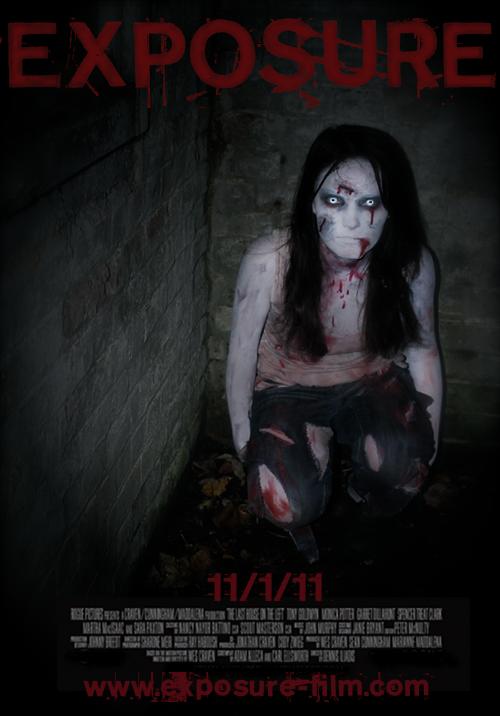
From looking at various existing horror posters, we identified the key forms and conventions needed to produce our own for Exposure. The Abandoned, Shutter and Saw all either used blood red or white colours for the typography. We experimented with various fonts; DaFont.com supplied us with plenty of choice to find the suitable typography. We chose to use ‘NeoPrint’ which show letters as bold, blood splattered and rough around the edges to represent the horror genre.
When designing the poster and deciding where to place the text we needed to use, the Golden Ratio helped us to create a professional and eye grabbing piece. This considers the layout of all agents in the poster, split into three sections horizontally/vertically; in order to the make all elements work together. The title of the film is very clearly positioned at the top of the poster and the date of release, credits and website is placed at the bottom. This is broken up by the image placed in between the text, creating the three sections.


The colour of the image itself is black and dark around the edges, using a vignetting technique, so that the main focus and colour saturation is brought to the middle. Positioned in this way, the ‘evil girl’ is crouched down in the corner of the dark room, this emphasises her vulnerability and isolated situation. Emily is being made the centre of focus; her eyes have been edited to a much brighter white, which are directed straight towards the camera. This makes the audience feel uncomfortable with the eye contact, and this is a convention used and seen in existing film posters, such as those created for The Grudge. We have followed these key elements to producing a horror poster since we thought it the most professional and effective way to attract audiences.
WEBSITE
The internet is the revolution of ‘new media’ and is constantly growing and changing. The increased usage due to improved availability to users has meant that the internet is the most convenient way to gain information. We analysed as a group we didn’t like about websites and what we did, so we could produce the most professional looking ancillary piece. The specific website criteria we focused on were the functionality, design, content, originality and overall effectiveness. We looked at various websites such as ‘Let Me In’, to recognise the conventions of horror film websites.

The key elements we noticed were that we needed to include links such as Home, Info, Videos, Gallery and Cast to give the audience the information they needed about the film. The font used for this needed to be clear, still represent the genre and be user friendly. The whole website is on show and there is no need to scroll down, this makes the website much more user-friendly and clearer for the audience. The image used is positioned on the right hand side of the page, this again uses the golden sectors, which splits the website into three parts, making it more attractive and drawing more attention for the audience. By adding links to the bottom right hand corner of the page, it gives the opportunity to the audience to view extra information and background or exclusive content from the cast and production of Exposure. Our Flickr, YouTube, Twitter and Facebook accounts were added in order to provide this. The trailer plays automatically, and the page is locked so that until you have seen the whole trailer, none of the links will work, we could not do this however on Wix.com since it did not provide us with this feature. We also developed our website by using star ratings with comments about the film, in order to create a successful profile for the film and to influence new visitors to the site, since it will give a good impression, therefore making them want to see the film. By following the conventions from this media text, we have produced our own website, and concentrated on all aspects of functionality, content, design and orginality.
No comments:
Post a Comment